ALWAYS TIME FOR GAMES…
OUR DESIGN BRIEF: A LIVING ROOM WITH A white grown-up sofa for the adults. ONE that could withstand red wine stains. lots of space for kids playing. LOTS OF GRACE FOR mess. Could it be done?

Project Location: West University
Project Type: Living Room
She loved the floors and the patio doors. That’s what she told me when I walked in.
The house was a shell. A new construction house that #ClientTheDoctors had bought after looking at countless places. It had everything, she said, except personality. Could I bring some life into it?
Now, before I tell you about this space, I have to tell you about the homeowner, Phoenix. This woman is a firecracker. A powerhouse. She has more personality than three normal people put together. And this all-white-everything shell just didn’t fit. If I were going by personality alone, I would drench the house in color. BUT, in designing a space, it isn’t just about figuring out WHO the person is that you’re designing for, but also finding out how they want to FEEL in their space.
And Phoenix wanted to feel relaxed when she came home. She wanted to feel light. And welcome. She loved the natural light in this space and wanted nothing to obscure it. She worked so hard, that when she came home, she wanted to take a deep cleansing breath and feel her whole body just let go. So the goal was to infuse her home with her spirit, while keeping the airy aesthetic and relaxed feel.
To be fair, the house belonged to both of them. I talk about Phoenix because in truth, she and I worked on the house together. So in my mind, this was our dance.
I tell you all this so that you know the backstory of Phoenix’s Living Room. The Doors and the Floors. That’s what sold this house to them. So here’s a sneak peek.

Stunning iron doors led to the patio and really were the focal point of the Living Room. On the opposite side, there were stairs going up to the 2/F. Perpendicular to both was a fireplace with built-ins on either side. On the open side, was an open plan Kitchen with a very large island, and a Breakfast Area tucked to the side. Here are some ‘before’ pictures so you can get a sense of the space.


LAYOUT
While the room really only had one orientation for casual family living (i.e. face the long edge of a sofa towards the fireplace), there were a number of sofa and sectional configurations that could work.
We explored no less than 11 different layout possibilities. But once we drilled down Phoenix’s true goals for the space, the best layout became clearer:
Entertain as many people as possible, so it had to have a ‘conversation-area’ set up.
Both adults and kids would be using the space, so it had to be family friendly.
It had to be comfortable; like put-your-feet-up-on-the-couch-and-curl-up-for-a-good-movie comfortable.
This room would have the only TV in the house, so the orientation of the furniture had to make TV watching accessible.
While the family had a Game Room upstairs, that would really be where the kids hung out with their friends. Phoenix wanted this space to be where the family played board games and did puzzles together. So storage of games was a must.
Basically, this room had to play triple-duty and act as the primary Entertainment Space to receive grown up guests, the Living Room to receive Families with young children, and the all-in-one Family Living Room/Game Room/TV Room. It was also the pass-through between the Kitchen and Patio. Oh, and make it look pretty? Tall order, indeed!
Now, I can hear you naysayers clucking your tongue, thinking ‘pretty’ and ‘family-friendly’? No way. And to that, I say, you haven’t met Crypton, my darlings. And with that, we’re ready for our first design tip!
DESIGN TIP:
If you’re working on a room that needs to have ‘performance’ fabric (i.e. child-friendly), but you also want it to be stylish, then while there are many performance fabrics on the market, I wouldn’t go with any other than Crypton. And no, I’m not getting compensated by them. There are a few others, but in my experience, none measure up. Without boring you with all the details, which you can read yourself on their website if you like, Crypton uses a technology that makes fabrics stain, moisture, and odor resistant. In a word, as bullet-proof as you can get for upholstery. And if you’re wanting a white or light-colored sofa or sectional, there is no other option, if you ask me. I have some favorite Crypton fabrics, so if you’re stuck, reach out and I’m happy to share. Actually, let me know if you’d be interested in a whole post on my favorite Crypton fabrics and I could even show you where I’ve used them.
So back to the Layout. With all those needs, we knew there needed to be as much seating as possible, that the seating needed to be soft and cozy, and that the whole room needed to be stylish, but not precious. Plus we had to maximize storage.

The Final Layout
The layout we ended up with featured a U-shaped sectional, with a very long sofa console with shelving grounding it. This provided plenty of storage, and was fabulous to style. The round coffee table softened all the angularity of the boxy space and existing built-ins. We ended up flipping the chair and the poufs, because ‘in the field’ you sometimes find things ‘feel’ better one way than the other. And along the back wall, we placed a bench that could be pulled in for additional seating. We styled it later to add textural depth.
The sectional faced the fireplace and built-ins, and therefore faced away from both the Kitchen behind it, and the Patio Doors to the left of it. However, the layout still worked because the console table shelving behind the sofa was oriented towards the Kitchen, providing a full 360-degree styling plan. And the ‘conversation structure’ of the layout provided by the U-shaped nature of the sectional, plus the orientation of the bench, meant that there were enough seats pointed towards the Patio.
THE FOCAL POINT
We briefly talked about those stunning iron patio doors being such a focal point, but in truth, they were stealing the show. The term ‘Focal Point’ gets bandied about a lot, and I’m not sure if you’re clear on what that really means. So let me break it down so that you know how to use it in your home and in this case, you can understand why sometimes having a stunning focal point like these patio doors can be a problem.
Well, in interior design, in any room, you want to control where people’s eyes travel. These iron doors are large, taking up the whole span of the wall. And they’re dark in color. So, while making a statement, they also force you to look at them. They keep your attention. And in doing so, they distract you from anything and everything else in the Living Room, Kitchen and Breakfast Area. That means that as soon as anyone walks into #ClientTheDoctors home, they were immediately drawn to those doors and looking straight out of them!
The goal, therefore, became to downplay the iron doors a little and create a second focal point. Those handsome doors were still going to make a statement, but we had to balance that statement with something of equal weight and grandeur in each room. A counterpart, if you will.
The Living Room already had a worthy partner to dalliance with; she was just hiding. Like a scared, plain Jane who is whisked away by her fairy Godmother, and transformed into the most stunning, confident version of herself, we brought that fireplace to life. Pictures say it all, so I’ll let you decide whether you think the transformation was a good one:


She (the fireplace) already had the most magnificent, modern, stepped plaster façade, which we wanted to keep. But it was getting lost amongst all the white. We considered tiling the fireplace for a hot minute, but it seemed an unnecessarily expensive endeavor – just because you HAVE the money, doesn’t mean you MUST spend it. And truth be told, I wanted to allocate that investment to other places in the house that I had grand plans for. So I suggested wallpapering the fireplace surround, and dressing the fireplace up with the right accessories.
That’s right, ladies and gents – that is wallpaper. Wallpaper that is extra durable and can withstand heat, but wallpaper all the same. And both material cost and install came to about 20% of what tile and install would have cost. The dark wallpaper (a midnight background with a cream geometric pattern) was especially made in Europe and was totally worth the wait. It brings out the clean lines of the fireplace and makes it stand out further. The dark color also makes the TV less prominent, which is always a plus in my book! AND - ding, ding, ding – we achieved the objective of pulling the attention away from the iron doors exclusively. By providing another dark feature in the room that stretched all the way to the ceiling, we made the doors carry less visual weight.
By painting the firebox a matte black, we balanced out the black hole of the TV. But we put in gas logs with a minimalist Scandinavian vibe, to modernize the fireplace further.
And then a few brass fireplace accessories framed the fireplace perfectly. The fireplace screen was made from unlacquered brass - also called ‘living brass’ - which means that it patinas beautifully as it is exposed to air. The fireplace tools, set to the right, were made from black and gold, and while purely decorative (you don’t need fireplace tools for gas logs), they completed the vignette and so, were a small price to pay for a complete look. Note: sometimes, it’s worth buying a few accessories for a finishing touch.
We also replaced the ceiling fan with a modern svelte black number with brass accents. That further lifted the eye towards the ceiling.


DESIGN TIPS:
There are a few lessons here:
- Decide what your focal point should be in a room and build your space around it.
- To pull attention away from something dark, add something else dark in the room with the same height and volume. You’ll provide a counterpoint.
- Camouflaging the TV is ALWAYS a good idea. Don’t make it the focal point. That is, unless you want to give the impression that the TV is the most interesting thing, about you!
- Look for architectural details you can highlight in your space, even if you think you have none. Sometimes they are hiding in plain sight. And sometimes, they are easy to create by adding a small detail that introduces depth to the room.
- Think out of the box a little and don’t accept common solutions as the ONLY way. Just because a tiled fireplace surround is what is usually done, doesn’t mean there aren’t any alternatives. Being inspired to try ways of achieving a similar goal with different materials can save you both money and create a unique look.
THE FURNITURE
We knew Phoenix loved to entertain. Girlfriends, couples and families with kids – the full gamut of people were always at the house and the Living Room had to be flexible enough to accommodate them all. And it had to be durable enough to handle all the inevitable spills and mess that come from so much fun.
Phoenix is the very definition of my typical client – someone who wants a stylish home that is not at all precious. She didn’t want to be running around behind everyone with a towel in hand!
So we were careful to choose furniture that was, what I like to call, ‘bullet-proof’. First we chose an oversized 12’ x 18’ to define the Living Room area. The super soft rug, made from a nylon and polypropylene blend, defined the Living Room area in the large open plan space. The materials gave it a lovely raised pattern and lent it the feel of an expensive silk rug, but in terms of care, it was a simple dish-soap-and-water clean up for any spills – including red wine.
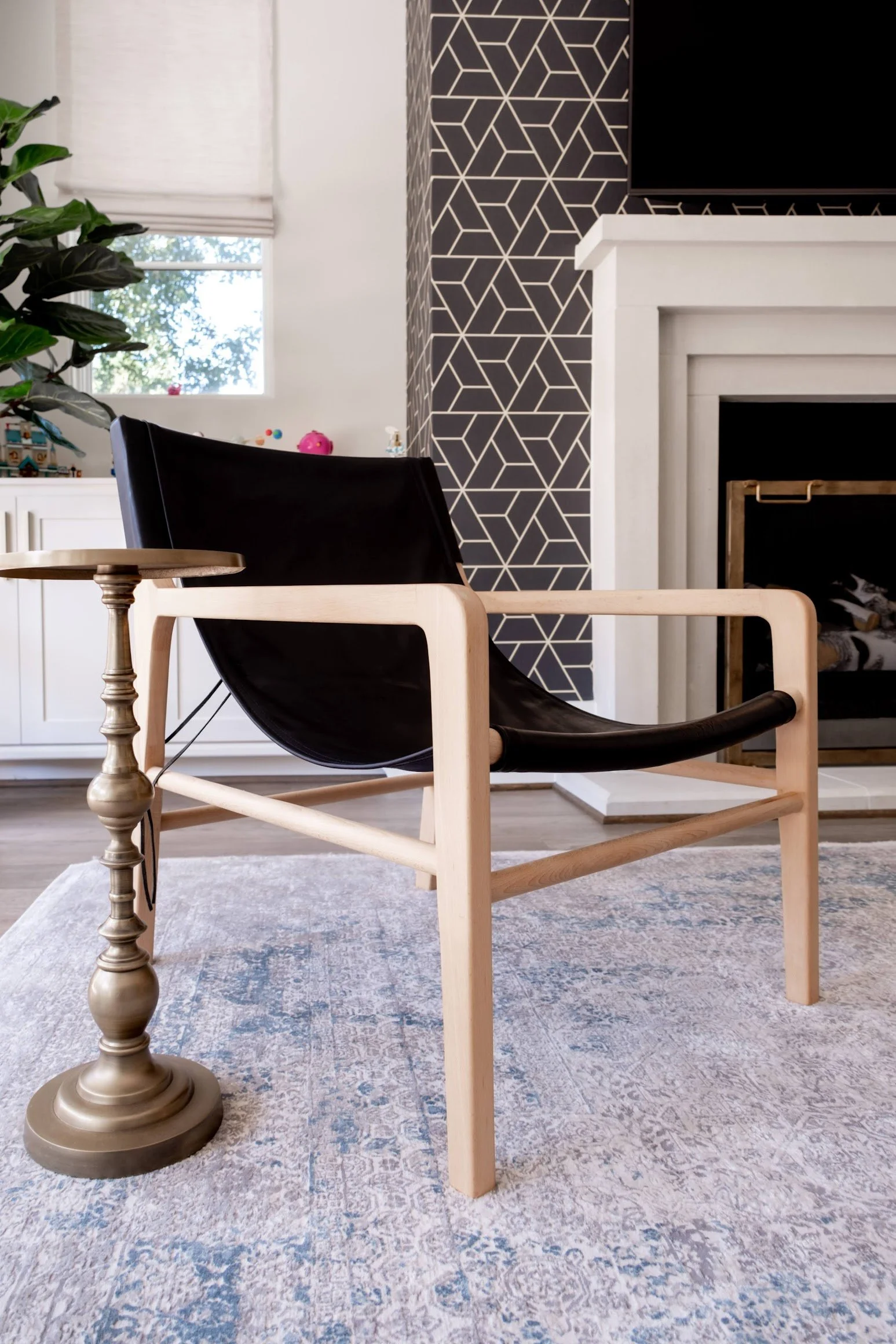
The lovely U-shaped sectional was a custom piece designed to float perfectly in the middle of the room and allow for large walkways on either side. We edged it ever so slightly over to the right to allow for more room in front of the patio doors, but we tricked the eye into thinking the whole living room arrangement was centered by floating a minimal black leather sling accent chair and martini table towards the left.
DESIGN TIP
Whenever you are placing a chair off to the side, it is always a good idea to plan for an end table or a small martini table next to it. This saves them from having to get up from the chair to set a drink or anything else down.
In the center of the arrangement, we floated a coffee table. We chose an ebony circular wood table suspended on iron legs. The floating nature of the table kept things airy, even with the dark color of the table. The circle table counteracted the linearity of the room and helped soften all the hard lines of the space. If you look closely, the sling chair and the sectional also had soft curves as well for the same reason.


With such a large sectional, it was also important that everyone seated on the sofa have a space to set down drinks, books and anything else they had in their hands too. Since the sectional was a U-shaped one, end tables didn’t make any sense. So we used lovely etched brass C-tables instead. C-tables are literally shaped like the letter ‘C’ and have a single leg that is set to one side, so that the base slides under the sofa and the top goes over the top of the sofa. This allows you to move it around the sofa at your will so you can find a convenient perch.


We also needed space to store games and while she had the built-ins, we felt like a better solution could be had. So we came up with a plan. A game plan, if you will.
The common thing to do in a situation like this is to get a sofa table (also called a console table). This is a skinny table placed behind the sofa, so you can reach behind you and set down drinks and the like. We decided to take advantage of the open layout and purchase a double console shelving unit. The console shelves faced outward towards the kitchen and were the first thing you saw as you looked down the hallway from the entry, towards the Living Room. With three shelves each, this fabulous piece of furniture gave us plenty of room for both storage and styling. But since it was all open, it was important that the pieces in here be functional AND beautiful. No problem, I said with a glint in my eye!


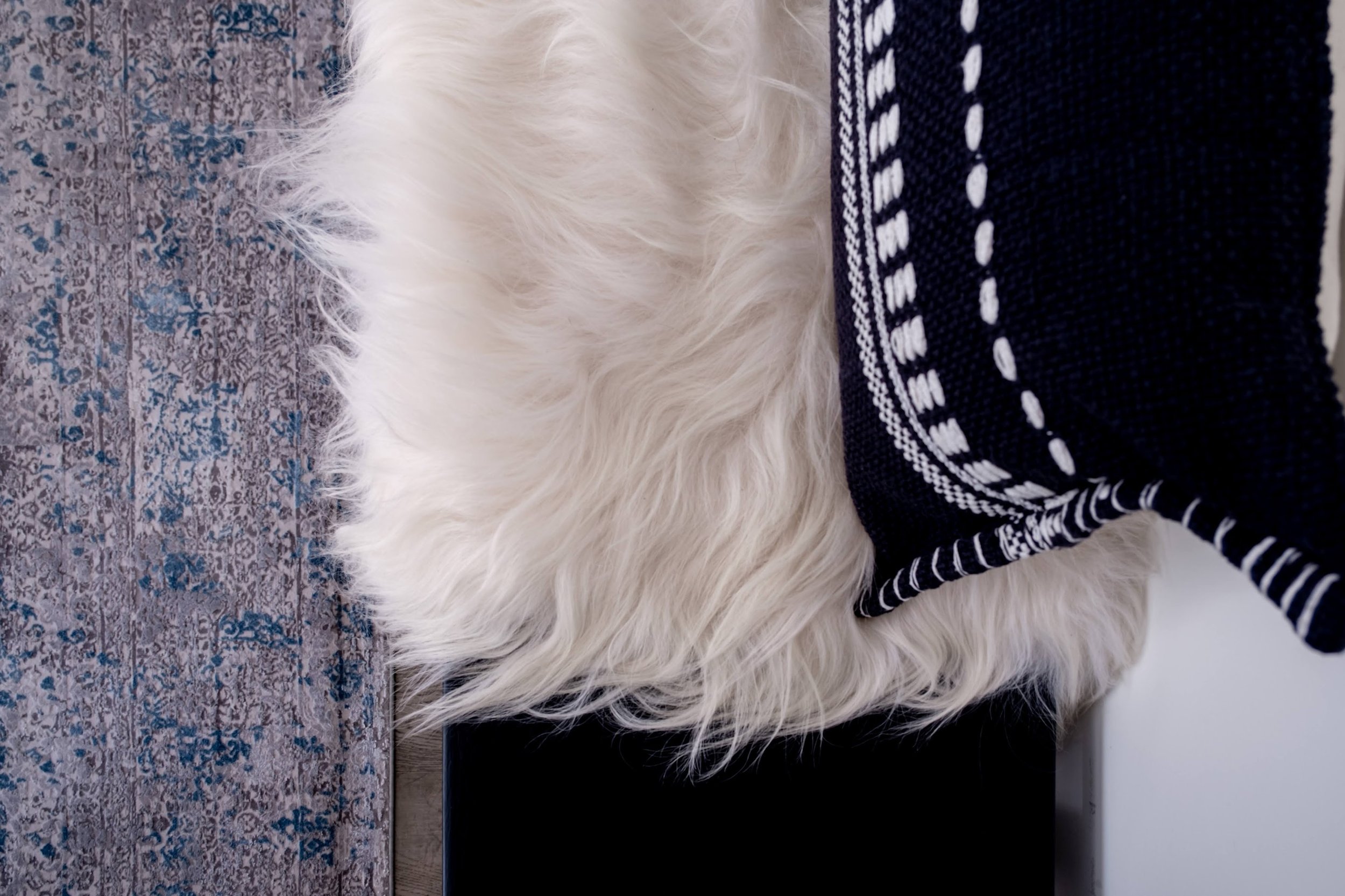
The final piece was the bench. Phoenix already had a solid wood bench that was sturdy and in great shape. So when I suggested we place a bench for additional seating along the wall that led up the stairs, she showed it to me. To modernize the rustic feel, we had it painted a matte black, and laid a sheepskin throw and a geometric pillow on top. And voila, we had the final piece of furniture for the space.


PLAYING GAMES
Accessories are my jam. If you spend a great deal of time and effort decorating a room with furniture and drapery and then sit back and wonder why your room is falling flat, the answer 9 times out of 10 is that you spent no time or money on accessories. Accessories make a room. They bring it to life. And most people have no idea how important they are.
An accessories plan does not simply involve going out and buying some vases and calling it a day. And what I hate the most about Pinterest and the Internet and all these home design websites that tell you how to style a bookshelf is that they only give you half the equation. Yes, you need to mix high objects and low objects. Yes, things look good together in threes. And so on. But they forget to tell you the most important thing at all.
And that is this: accessories are meaningless without you. Accessories bring personality into a space. So if you don’t inject some of YOUR personality into your accessories – that is, if they mean nothing to you – then your whole space will fall flat.
If you want to know how to create a space that reflects you, then if you learn nothing else from me, learn this: choose objects that YOU love and that tell the story of your journey. Really think about what that journey has been and what means something to you and put in accessories that mirror that.
Not only will it make your home sing, but it will make decorating your space so easy. And it will make you happy every time you are in your space.
Okay, so back to Phoenix’s Living Room. I think I mentioned right from the get-go that Phoenix is a woman that gets how important accessories are to make a space come alive. Since she envisioned this Living Room actually being ‘lived’ in – that is, she imagined playing Scrabble here with her two girls, and curling up on the sofa to read, and playing chess, and so much more - this Living Room was going to be a little more personal than most typical entertainment spaces. And it had to have all the trappings of a typical Game Room, but with some serious style.
So we brought in games – and lots of them – but they were incredibly beautiful acrylic models of classic games we all know and love: Backgammon, Chess, Jenga, Chinese Checkers, and so much more. A large Scrabble board and Monopoly board were set on the built-ins. We interspersed the games with stunning books from Phoenix’s long ‘want to read someday’ booklist that I asked her to put together.


We also bought some beautiful coffee table books to set under a distressed dough bowl she had bought on a particularly memorable girls’ trip she took with her besties. A few marble and bone inlay photo frames held some of her favorite memories. And then we finished out the styling with a couple of pretty things – beads, a globe, a paper weight, a couple of plants, etc.
We left plenty of room for new games, kids’ artwork and books that the family would inevitably bring home. And everything on those shelves, in addition to looking beautiful, had a function and was used.
I recently asked Phoenix if she ever read any of those stunning books we bought and she said yes, she did get through many of them. And not only that, but they played every single one of the ‘decorative’ games. The kids loved them – and so did she. Because ‘pretty’ can have a purpose, if you plan it that way. That is the best kind of styling, if you ask me…
To see more of The Doctors’ home, visit our Portfolio - The Doctors or follow us on Instagram
xxx Tash Loved reading this and want to turn your home into a space you absolutely adore? Follow @taashkistudios on Instagram and join the Taashki Tribe newsletter below if you’re not already signed up! Write and tell me what you struggle with in your home design and I’ll help you through your design woes!
WANT SOME HELP WITH DESIGNING YOUR DREAM HOME?Coming home to a space you love is simply magic. The sanctuary that you crave, that feeling of a warm hug enveloping you, that effortless comfort - it’s all there.
But creating that magic is anything but easy. It can be overwhelming and time-consuming. It takes vision, and is equal parts planning and art. There are SO many decisions to make, and sometimes, you just don’t want to go at it alone.
If you want a partner in this process who can steer you towards options that work best for your life and style; a knowledgeable guide to take you from ‘dream’ to ‘done’ and who can hold your hand every step of the way, our Interior Design Services might be just what you need.
And if you need help ‘finishing’ a room with styling and accessories, give us a call. We offer a ‘Designer by Your Side’ service which offers our time hourly or in a 20-hour block to help you with exactly this. We start our Styling Service with an Assessment of your space, followed by ‘Shopping’ your home. We look through things you already own to see what we can place to bring more ‘you’ into your space before we go shopping elsewhere. So if you need to complete a space, get on the schedule today!
Find out more about Taashki Studio or Schedule a Discovery Call to learn more about our process. We can’t wait to come on your journey with you!